

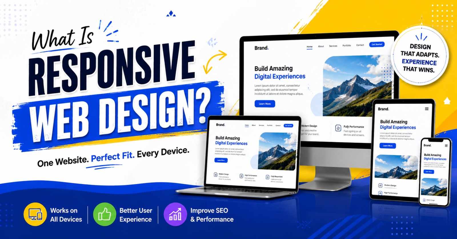
What Is Responsive Web Design? A Complete Guide for Modern Websites
If you’ve ever visited a website on your phone only to find tiny text, broken layouts, or buttons that are impossible to tap, you’ve experienced a website that isn’t responsive. In today’s digital world, where people browse the internet from smartphones, tablets, laptops, desktops, and even smart TVs, having a website that adapts to every screen size is no longer optional.
So, What Is Responsive Web Design? Simply put, it is a web design approach that allows a website to automatically adjust its layout, images, navigation, and content based on the screen size and device being used. Instead of creating separate websites for desktop and mobile users, responsive web design ensures a single website delivers an excellent experience across all devices.
Whether you run a business, an online store, a blog, or a corporate website, responsive web design is essential for improving user experience, search engine rankings, and conversion rates.
Understanding Responsive Web Design
Responsive web design (RWD) is a development technique that uses flexible layouts, scalable images, and CSS media queries to create websites that respond intelligently to different screen resolutions.
For example:
- On a desktop, your website may display three service columns.
- On a tablet, those columns may become two.
- On a smartphone, the same content stacks neatly into a single column for easy reading.
The goal is simple: provide visitors with a smooth browsing experience regardless of the device they use.
Why Responsive Web Design Matters
Internet usage has changed dramatically over the last decade. Mobile devices now account for a significant portion of global web traffic, making responsive websites more important than ever.
Here are several reasons why responsive design should be a priority.
Better User Experience
User experience plays a major role in website success. Visitors expect websites to load quickly, display correctly, and be easy to navigate.
Responsive websites offer:
- Easy-to-read text
- Clickable buttons
- Properly sized images
- Smooth navigation
- Faster interaction
When users enjoy browsing your website, they are more likely to stay longer and take action.
Improved SEO Performance
One reason businesses frequently ask What Is Responsive Web Design is because of its connection with search engine optimization.
Google recommends responsive websites because they provide a consistent experience across devices. A responsive website helps:
- Improve mobile usability
- Reduce duplicate content
- Increase page engagement
- Lower bounce rates
- Improve search rankings
A website optimized for mobile users has a stronger chance of appearing higher in search results.
Higher Conversion Rates
A beautiful website means little if visitors cannot easily complete desired actions.
Responsive design helps users:
- Contact your business
- Fill out inquiry forms
- Purchase products
- Subscribe to newsletters
- Book appointments
The easier these tasks become, the more conversions your website can generate.
Key Features of Responsive Web Design
Responsive websites rely on several important design principles.
Flexible Grid Layouts
Instead of fixed-width layouts, responsive websites use flexible grids that automatically resize according to the visitor’s screen.
This creates a balanced appearance regardless of display size.
Responsive Images
Images should resize proportionally without becoming distorted or slowing down page loading.
Modern responsive websites also use optimized image formats to improve speed.
CSS Media Queries
Media queries allow developers to apply different styles depending on screen width, orientation, and device characteristics.
This ensures content looks polished on every screen.
Mobile-Friendly Navigation
Menus designed for desktop screens rarely work well on smartphones.
Responsive websites often include:
- Hamburger menus
- Sticky navigation
- Large touch-friendly buttons
- Simplified navigation structures
These features improve usability on smaller devices.
Benefits for Businesses
Business websites benefit greatly from responsive web design.
Stronger Brand Image
A professional website creates trust. When visitors encounter a clean, modern, responsive website, they naturally view the business as more credible.
Easier Website Management
Without responsive design, companies often maintain separate desktop and mobile websites.
This creates:
- Extra maintenance
- Higher costs
- Duplicate content
- Longer update times
Responsive web design eliminates these issues by allowing you to manage one website for all devices.
Faster Website Loading
Website speed affects both user satisfaction and SEO.
Responsive websites typically use optimized coding techniques and compressed images to improve loading performance.
Faster websites keep visitors engaged.
Lower Development Costs
Building and maintaining one responsive website is generally more cost-effective than developing separate versions for different devices.
It also simplifies future updates and redesigns.
How Responsive Web Design Improves SEO
Businesses often wonder if responsive design directly impacts rankings.
While responsive design itself is not the only ranking factor, it supports several important SEO signals.
Mobile-First Indexing
Google primarily indexes the mobile version of websites.
If your mobile experience is poor, your rankings may suffer.
Responsive web design ensures your content performs well under Google’s mobile-first approach.
Reduced Bounce Rate
Visitors leave websites quickly when pages are difficult to use.
Responsive layouts encourage users to remain on your website longer, improving engagement metrics.
Better Internal Linking
A single responsive website keeps URLs consistent across all devices.
This strengthens your site’s authority and simplifies indexing for search engines.
Common Mistakes to Avoid
Even responsive websites can have problems if not developed correctly.
Some common mistakes include:
- Oversized images
- Small clickable buttons
- Poor font sizing
- Slow page speed
- Cluttered navigation
- Elements extending beyond the screen
Avoiding these issues ensures visitors enjoy a seamless browsing experience.
Best Practices for Responsive Web Design
If you’re planning a new website or redesigning an existing one, follow these proven practices.
Design for Mobile First
Begin with the smallest screen and gradually expand the layout for larger devices.
This keeps designs clean and user-focused.
Optimize Images
Compress images without sacrificing quality.
Use modern image formats and responsive image techniques whenever possible.
Use Readable Typography
Choose fonts that remain clear on all devices.
Avoid text that becomes too small to read comfortably.
Test Across Multiple Devices
Never assume a website looks perfect everywhere.
Test your website on:
- Android phones
- iPhones
- Tablets
- Windows laptops
- MacBooks
- Large desktop monitors
Comprehensive testing identifies layout issues before visitors encounter them.
Focus on Performance
Minimize unnecessary scripts, optimize CSS, and improve server response times.
Fast websites consistently outperform slow ones.
Industries That Benefit from Responsive Web Design
Virtually every industry can benefit from responsive websites, including:
- E-commerce stores
- Educational institutions
- Healthcare providers
- Law firms
- Financial services
- Restaurants
- Travel agencies
- Real estate companies
- Technology businesses
- Digital marketing agencies
No matter the industry, users expect websites to function perfectly across all devices.
Why Choose The Blue IT for Responsive Website Design?
Creating a responsive website requires more than simply resizing elements. It demands thoughtful planning, clean coding, user-focused design, and SEO best practices.
At The Blue IT, we develop responsive websites that combine attractive design with outstanding performance. Our team focuses on delivering websites that load quickly, look professional, and provide a seamless experience on desktops, tablets, and smartphones alike.
Whether you need a business website, an eCommerce platform, a portfolio, or a custom web application, we create responsive solutions that help your brand stand out online.
Final Thoughts
Understanding What Is Responsive Web Design is essential for anyone building a modern website. A responsive website adapts effortlessly to different screen sizes, improves user experience, supports better SEO, and helps convert more visitors into customers.
As internet users continue to rely on mobile devices, businesses that invest in responsive web design gain a significant competitive advantage. A website that is attractive, fast, accessible, and easy to navigate creates lasting impressions while supporting long-term business growth.
If you’re ready to upgrade your online presence, investing in responsive web design is one of the smartest decisions you can make. With the right strategy and experienced professionals like The Blue IT, your website can deliver exceptional performance across every device and provide the foundation for sustained digital success.

Leave a Reply